


Understanding Colors for AI Artists
Why you need to grasp RGB, CMYK and HSL colors

With AI Art, you write what you want and there is no need to know traditional artist stuff like color models, right? Wrong, if you really want to get good at AI Art, you need to actually learn the usual stuff that any artist has to master.
In this regard, the current article isn't specific to AI artists, but to anyone who would like to get into photo editing or digital painting. But it is written from the perspective of someone who primarily do AI art.
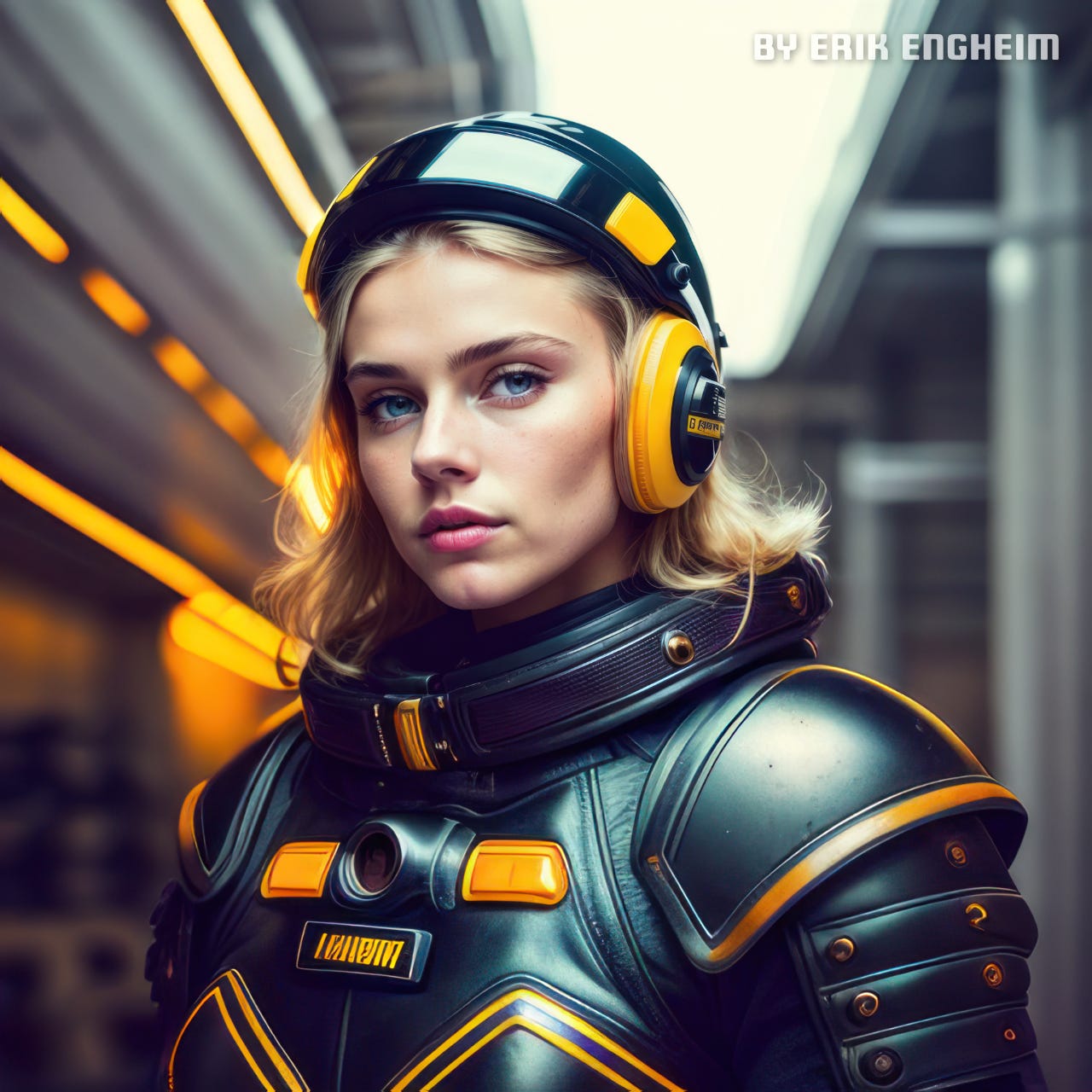
Let me give some context for why an understanding of colors matter. Consider the title image of a futuristic female astronaut. It was generated with a text prompt containing text similar to the one you see below:
woman in shiny hard yellow moulded plastic futuristic armor,
helmet, quantum effects, neon lights, space futurism
From this text, an AI art generator tool built around, for instance, the Stable Diffusion library, can generate a variety of images upon the same theme. If we add an image to guide the process, we will typically get an image which are smaller or larger variation upon the starting image depending on your settings. This approach is what we usually refer to as image to image.
Of all the similar images you get out, you rarely get one perfect image where everything is great. Maybe the suite worn by the astronaut looks superb in one image, but the face looks bad. Or perhaps one image has a good-looking face but the eye color or hair color is wrong. If there are hands in the image, they will likely go wrong. The left hand might be fine while the right hand is horribly mutated, or vice versa.
In other words, you need to be able to composite images, and combine the best elements from different images into one perfect image. Blending in parts from one image into another is a separate skill I will not cover here. Basically, it involves using masks to obscure parts of an image you don't want included and let good parts from an image in a layer below shinethrough.
Blending in parts was the first skill I developed, but I quickly noticed that something looked off. The reason things look off when you composite different images in AI Art is because the light and color tends to be slightly different. It is very noticeable on skin tones if you try to composite a face from different images.
If you try to match up colors by just winging it and not understanding anything about colors, I can promise you the result will not be good. Instead, there is a preferable sequence of actions to perform in order to adjust colors in an optimal manner:
Adjust brightness and contrast
Adjust hue, saturation, and luminosity
But if you are attempting to improve the appearance of an image, rather than matching colors, you may want to use the selective color panel to adjust just blues and red, for instance.
The Curves adjustment layer is another popular way to adjust color. All of these approaches allow you to do many of the same things, but which approach is best is easiest to determine if you understand some color theory.

I want to discuss different color models such as RGB and CMYK in the context of working with common color adjustment layers in Affinity Photo. For you Photoshop users, there should be very similar adjustment layers in Photoshop.
The Color Balance Adjustment Layer Properties Dialog
These color adjustment layers come with different dialogs allowing us to tweak their properties. Let us focus on the first dialog for the Color Balanceadjustment layer.

Notice how there is a slider for cyan and red color. Why that specific combination? It may seem odd given that red is one of the primary colors in the RGB additive color model, while cyan is a primary color in the CMYK subtractive color model.
To understand why, it helps to look at the triplets of primary colors and how they blend to form new secondary colors. The RGB color model mimics how colored light is combined. Thus when combining red and green we get yellow. Combining all the primary colors in the RGB model gives us a white light (technically white and black are not colors but I will ignore this fact in this article to simplify my writing).
CMYK in contrast models how paint works. Red is obtained by combining magenta and yellow color pigments, while adding magenta, cyan and yellow paint gives us black paint.
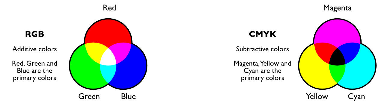
Let us get back to why the color balance dialog uses red and cyan in the same slider when working with RGB colors. Imagine you have a white colored area which you want to turn more red. If the RGB values are (255, 255, 255) or alternatively #FFFFFF in hexadecimal form, then you cannot add any more red color. You are maxed out. Instead, you need to reduce the green and blue color components.
But green and blue together represent the color cyan. Cyan is the color you get when you combine green and blue. In other words, if you remove the cyan color from the white color, then you get a more red color. The more cyan you remove, the more reddish color you get.
The reverse is then also true: The more cyan you add to a color, the less red it becomes. You can read this right out from the color triplet diagram! Ask yourself how you make a color more green. Use the same logic, just discussed, to determine what color must be removed.
To get more green, we need to remove red and blue. Together, red and blue creates magenta. In other words, adding magenta makes something less green, while removing magenta makes a color more green.
When comparing skin colors, this can be easy to confuse. I personally mix up red and magenta when looking at skin colors. Often a skin tone which looks more red than another is really more magenta. What that means is that it has both more blue and more red. Reducing the magenta color would then mean adding more green.
Alternatively, you want a more yellowish hue on the skin tone. In that case, you want to remove the blue. Yellow doesn't contain blue, so removing blue from a color will turn it more yellow. Thus we can summarize which colors are opposites or more specifically complementary colors:
Cyan and red
Magenta and green
Yellow and blue
My favorite YouTuber on photo editing, Olivio Sarikas, covers these three dialogs in detail in his video: HSL vs Color Balance vs Selective Color - Affinity Photo Tutorial
I am adding some context to what he is talking about, as he never gets that much into why, e.g., the HSL adjustment layer is used so frequently by photo editors.
The Hue Saturation and Luminosity Adjustment Layer
Interestingly, I understood the purpose of the HSL adjustment layer better by watching a video by Brandon James Greer, who does pixel art rather than photo editing or AI Art.
He made several important points which, judging by all the comments, are skipped by a lot of art schools and training courses on painting and digital art:
Bright tones do not approach white but yellow color
Dark tones are bluish (or purple) rather than blackish
This has some obvious implications for people doing pixel art. If the base color of an object is red, then the highlights on that object should not be a brighter red, but something shifted more towards yellow, such as orange.
Making the red darker implies shifting it more towards purple, which means the darker version will start by looking like magenta. Remember, as we add blue, we get something looking more like magenta. Keep in mind, we cannot only shift the hue. We would also adjust luminosity and saturation as one would normally do.

The latter is rather obvious, but the need for a hue shift is less obvious. Why are bright tones more yellow and darker tones more blue? Because sunlight isn't entirely white. The blue light from the sun fills the sky. If you remember our earlier discussion and look at the RGB triplets, you will see how removing blue light from white light gives us a yellow light.
This means that areas of an object hit directly by sunlight will become more yellowish. But why are the shadowy areas bluish? If you look at images of the moon, you will notice that the shadows are very sharp and black. That is because the moon has no sky to distribute ambient light. On Earth, the blue sky will give a faint blue tint to areas in the shade.
You will see this in movies or comic books when characters are moving through shadowy areas. The comic strips would not be painted in grays, but in bluish or purple hues.
Okay, so how do we apply this knowledge in our work? The same face exposed to different levels of sunlight and shadow will have shadows, mid-tones and highlight hue shifted differently. The exact same object will under different light conditions have a hue shift of all color tones.
That is why you would expect when trying to matchup the skin tones of two different faces that they will have a different degree of hue shift. The HSL panel exists and is useful for the simple reason that the objects we deal with in photography and in AI art represent things which are typically illuminated by sunlight directly or indirectly.
That is why simply adding more red or blue to every skin tone might not work because in addition to changing the darkness or intensity of a color you also have to adjust the hue. The lighter tones will not only be lighter, but also have a slight hue change relative to the base color of an object.
The HSL panel, however, affects all colors within a certain hue range. That isn't always what you want. That is why the color balance adjustment layer exists. It allows us to modify highlights, shadows, and mid-tones separately. HSL typically does minor adjustments, but one face might have much stronger shadows and highlights than another, which is why you need to be able to target the bright and dark areas separately.
The Selective Color Adjustment Layer Properties Dialog
A third twist on the business of adjusting colors is the selective color panel. I think it is easier to think about this dialog box as a form of sophisticated mask. Usually, we define a mask to limit what area we are performing a color adjustment on.
But instead of defining a mask, we can use the selective color adjustment layer to only target areas with specific colors. E.g., instead of creating a mask for the whole sky, we could just select blue colors as our target. The selective color adjustment layer then lets us add more yellow, magenta, black or cyan to this selected color.
Of course, there will always be overlap. For instance, skin color will partially match reds and yellows. However, the overlap is often small enough that it isn't a big problem. If you just want a simple and quick way of adjusting different areas of your image, this is much quicker than using a mask. Or you could combine both. Just create a very rough mask and rely on the fact that by targeting specific colors, the border regions between one type of color to another will not be much affected.
Summary
Different color adjustment panels exist because the nature of the color adjustment jobs can differ substantially. Occasionally, you just want to have a more blue sky, or greener trees. In this case, you pick the Selective Color adjustment layer.
Other times you are trying to color match two images which have been exposed to different degrees of light. In this case, the HSL panel tends to be ideal as it allows you to mimic what happens under natural lighting conditions where brighter light shifts everything into a more yellow hue while darker light shifts colors towards the blue spectrum.
While matching colors, you may also notice that highlights, mid-tones and shadow areas don't match well, and you want to adjust those separately. That is when you use the Color Balance adjustment layer. It allows you to target areas of different brightness separately, unlike the Selective Color panel, which targets areas by color rather than brightness.
In all cases, it helps to have a firm grasp of the primary colors and their complementary colors.
Complementary colors are pairs of colors which, when combined or mixed, cancel each other out (lose hue) by producing a grayscale color like white or black.
One example is red-cyan. These two colors cancel each other out when combined. Thus, when observing an image and determining, there is too much red in it, then you would conclude adding cyan would help.